
In our previous deep dive into the Fama-French 5-Factor Model, we explored how the broad index doesn’t actually tell the whole story of stock returns. We learned that underneath the surface, structural factors like size, value, and profitability are the true engines of performance. In this article, we will apply that same skepticism to the most influential index in our everyday lives: the Consumer Price Index (CPI).
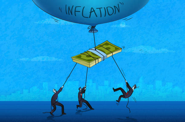
As we close out 2025, the headlines are filled with talk of a “soft landing.” The Australian Bureau of Statistics (ABS) reports that headline inflation is cooling toward the RBA’s target band. Despite this, if you speak to anyone paying a mortgage in Sydney or buying groceries in Melbourne, the sentiment is vastly different. There is a growing discrepancy between the Official Model and the lived experience, drawing attention to the accuracy and validity to the model.
How the Engine is Built

To understand why the CPI feels “off,” you have to understand how it’s calculated. Australia uses a framework known as the Laspeyres Index.
The logic is straightforward: Imagine you took a photo of your typical grocery trolley three years ago. The Laspeyres model tracks the cost of that exact same trolley today. It assumes your habits are frozen in time.
In theory, this is the gold standard for consistency. It tells us how much more it costs today to live the exact same lifestyle we lived yesterday. However, in practice, this model possesses structural flaws that systematically understate the erosion of your purchasing power.
This formula is the mathematical engine used to calculate the official inflation rate. It translates millions of price changes into the single, headline ready percentage we see in the news:
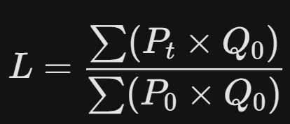
The Bottom (Denominator): What you paid for your “basket” of goods in the past (Base Price × Base Quantity).
The Top (Numerator): What that same basket costs at today’s prices.
By assuming your “quantity” never changes, it ignores the reality of how we actually live. It doesn’t account for the fact that when prices spike, we don’t just pay more, we instead change what we buy.
Substitution bias not being accounted for
The biggest assumption in the Laspeyres model is that consumers are static. It assumes that if the price of steak rises by 30%, the consumer will continue to buy the exact same amount of steak.
In reality, any consumer knows this is just unsustainable and illogical. To combat the price spike, you substitute. You buy chicken instead, given the price makes it the perfect substitute.
Economists call this Substitution, and to make the CPI look more “rational” they often use a technique called geometric weighting. This is essentially a “smoothing” mechanism that automatically assumes if a price goes up, you will naturally buy less of that item and move toward a cheaper alternative. While this makes the mathematical model look balanced, it hides a painful truth: a decline in the consumers standard of living.
In a stable economy, your purchasing power should allow you to maintain your lifestyle, not merely your caloric intake. When the model celebrates a cooling inflation because consumers have collectively downgraded from fresh produce to frozen, or from brand name essentials to generic substitutes, it is essentially documenting a managed decline. This suggests that as long as you can still afford something, the system is functioning, even if that something represents a significant step down from the life you worked to build. This reiterates the idea that the metric sees consumers as statistics rather than actual people, showcasing the gap in validity in any statistics being deduced via the studies being based on the merit of the Model.
This is the ultimate “Invisible Tax.” Unlike a levy on your paycheck, which is transparent and quantifiable, this tax is extracted through the quiet erosion of your choices. It turns the CPI into a measure of survivability rather than prosperity. It is essentially a trapdoor waiting for any consumer who is below the upper middle class line, waiting for them to fall through and face this increasingly common issue that is difficult to combat without sufficient resources, forcing the consumer to make these personal financial sacrifices not out of a willing decision, but rather by forcing them into a corner with no other option.
The ‘Phantom Quality Gains’
This is where the model moves from math to philosophy, and it’s where the “Invisible Tax” becomes truly apart of our everyday life as a consumer. The ABS uses hedonic adjustments to account for quality improvements in the things you buy.
Imagine you bought a laptop in 2023 for $1,500. In 2025, the new version costs $1,700. To your bank account, that is a $200 (13%) increase in your cost of living. Despite this increase that supersedes that of the average wage of 4.2% per annum (per ABS as of December 2023), an economist might look at that laptop and see a faster processor or a higher-resolution screen. They may decide that the “quality” of the device has improved by 20%.
So what does this have to do with the CPI? The index may actually record a price decrease for that laptop. Because you are getting “more units of utility” per dollar, seeing the model claim that you are technically wealthier, even though you are out of pocket an extra $200. This is known as utility math. When this math collides with the cash flow reality, we see a flawed and inaccurate assessment of the average consumers “wealth” as it is disproportioned through overstated positions they are in (like the $200 improvement on the laptop).
A sharper screen doesn’t help you cover your electricity bill, yet the model uses these phantom gains to offset the very real rising costs of essentials. It’s a mathematical gaslighting that tells you that you’re living better, while your disposable income tells a different story.
The Measure Gap
In our Factor Investing post, we noted that a broad index often fails to capture specific underlying risks. This same principle applies to how the CPI handles housing, the largest single expenditure for most Australian households.
The CPI does not directly track mortgage interest repayments. Instead, it utilizes a “Rental Equivalence” or “New Dwelling Acquisition” approach to estimate shelter costs. Throughout 2025, as the RBA maintained elevated interest rates, the significant increase in the debt-servicing component of household budgets was largely excluded from the headline inflation percentage.
By focusing on the price of the house rather than the interest required to pay for it, the model treats mortgage costs as an optional financial choice rather than a mandatory cost of living. For a household whose monthly payments have jumped by $1,500 due to rate hikes, the “official” 3.8% inflation figure is a technical statistic that fails to reflect their actual cash-flow reality.
This creates a structural gap between the government’s data and the real-world expenses of anyone with a mortgage or significant debt. Essentially, the model measures the cost of the “building,” while the consumer is struggling with the rising cost of the “loan” required to live in it.
Inflation is the biggest threat to your portfolio
In the world of finance, we often measure success against the S&P 500 or the ASX 200. But for the individual investor, the most important “index” is The Inflation erosion benchmark. This is the personal inflation rate you must beat before you’ve made a single cent of real profit.
If you have architected a portfolio using the 5-Factor Model (as suggested in our previous article) and achieve a 9% return, you might feel successful. But if your personal benchmark, being driven by the true cost of interest, insurance and energy falls short and accomplishes a return of 7% while the CPI claims 3.8%, your real return is a mere 2%.
Just as we look for “value” stocks to find companies trading below their intrinsic worth, we must look for “real” returns that stay ahead of this invisible competitor. If you trust the official index to set your goals, you are building your future on a foundation of sand. You aren’t just fighting market volatility; you are fighting a measurement error that is quietly winning the race against your savings.
Why Inflation is Your Portfolio’s Greatest Threat
- It’s Permanent: Market crashes eventually recover, but inflation is a permanent loss of purchasing power. A dollar lost to the rising cost of bread or rent never bounces back. It becomes the new “normal”.
- It’s Invisible: Because your account balance is still moving upward in nominal terms, you don’t feel the “tax” until you attempt to exit the market and spend the money.
- It Compounds: Just as interest compounds on your gains, inflation compounds your losses. Over a 10-year horizon, a 4% “measurement gap” between the CPI and your actual costs can erase nearly 40% of your future purchasing power.
Understand the Model, Protect your wealth
This is the structural reality of the 2025 economy. You can ignore the flaws in the model, but you cannot ignore the erosion of your wealth. To protect your world, you must stop measuring progress by the “official” yardstick and start building for the real one.
The CPI serves a specific purpose for central bankers managing policy, but it was never designed to be a personal accounting tool for the individual. To navigate this “Invisible Tax” and outperform your own inflation erosion benchmark, you must move from passive observation to active analysis
We are building a community of thinkers who refuse to take the “Index” at face value. If you want to move beyond the headlines and understand the mechanics of your money, join our journey to financial understanding and freedom.
Know the market. Understand the world.
Join the Factor Insights Newsletter today: it’s free, data-driven, and designed for the disciplined investor

Leave a comment